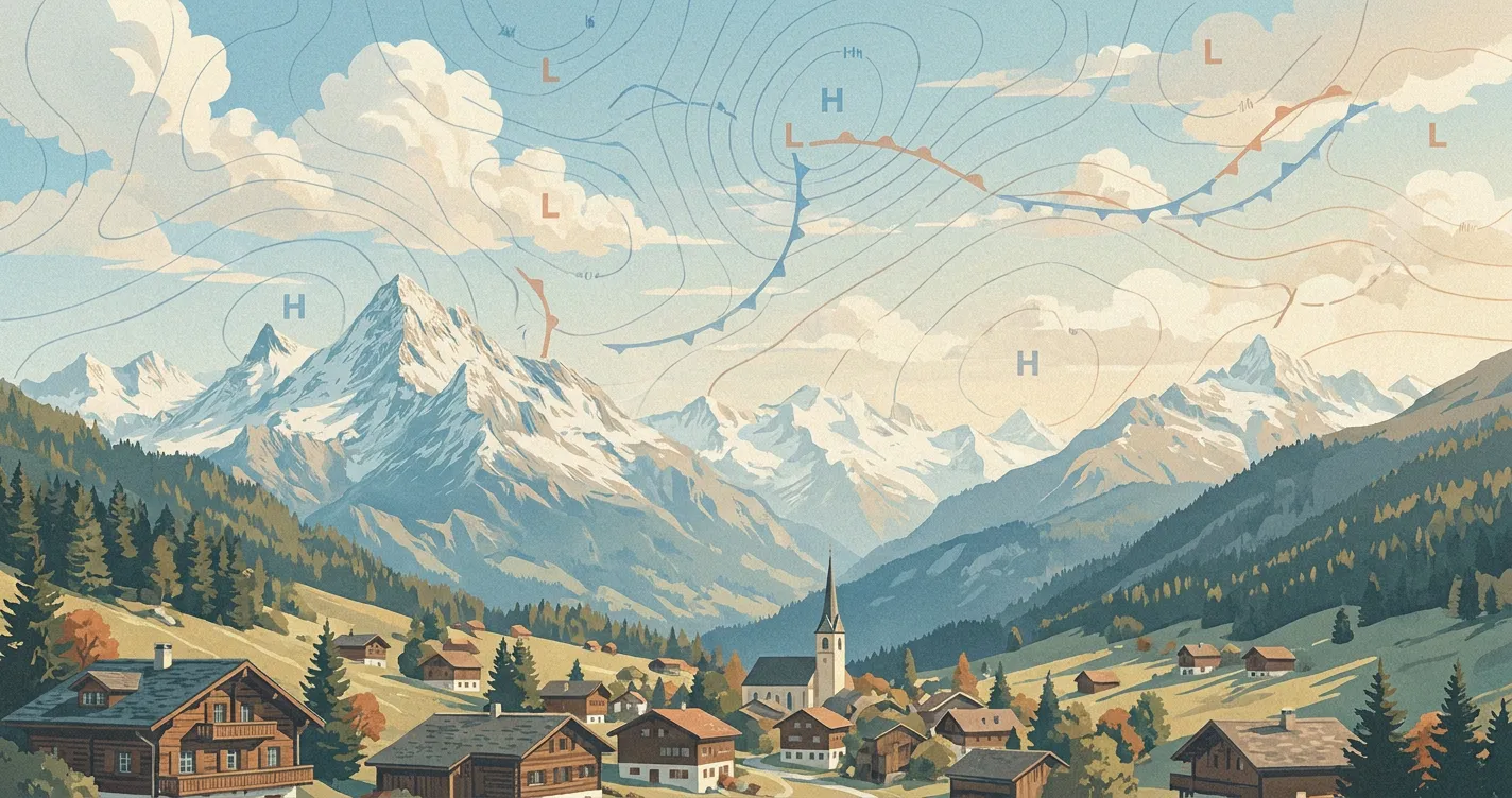
A synoptic chart shows the large-scale weather pattern at one valid time. Read it as a structured overview, then combine it with a local forecast, observations, radar or satellite imagery, and official warnings.
What a Synoptic Chart Shows
The surface charts used in everyday forecasting commonly show mean sea-level pressure, high and low pressure centres, isobars, fronts, troughs, and ridges across a large area. A shared valid time lets you see how the features fit together instead of comparing observations taken at different moments.
An analysis chart estimates the state of the atmosphere at its valid time from observations and other data. A forecast chart shows an expected future pattern. The issuing service may generate, analyse, or adjust those features in different ways, so check the title, valid time, time zone, legend, and provider notes before reading the map.
This is a broad view, not a street-level forecast. Mountains, coasts, cities, and individual showers or thunderstorms can produce local conditions that the chart does not resolve.
Start with Isobars and Relative Pressure
Isobars join places with the same atmospheric pressure, usually reduced to mean sea level so locations at different elevations can be compared. Values commonly appear in hectopascals, or hPa. One hectopascal is numerically equal to one millibar.
Read the labels before judging the pattern. Providers can use different isobar intervals, and the map scale affects how close the lines appear on screen.
A low has lower pressure near its centre than its surroundings. A high has higher pressure near its centre than its surroundings. No fixed pressure value separates the two. A trough is an elongated zone of relatively low pressure, while a ridge is an elongated zone of relatively high pressure.
Isobar spacing gives a first clue to the pressure gradient. Closely spaced isobars generally indicate a stronger large-scale pressure gradient than widely spaced lines. They do not give an exact surface wind speed. Latitude, curvature, friction, terrain, convection, and coastlines all affect the wind that people experience. Wind Speed Explained covers sustained wind and gusts.
Read Wind Around Highs and Lows
The pressure-gradient force starts air moving towards lower pressure. Earth’s rotation deflects that motion, while surface friction slows the wind and lets it cross isobars at an angle.
In the Northern Hemisphere, surface flow generally turns counterclockwise and inward around a low, and clockwise and outward around a high. The directions reverse in the Southern Hemisphere. This is an idealized large-scale pattern. It becomes less useful close to the equator, and terrain or local circulations can substantially alter it anywhere.
Pressure patterns give context rather than a weather guarantee. Lows often support rising air, cloud, wind, and precipitation, but dry or clearer sectors can occur within them. Highs often support sinking air and quieter weather, yet they can also trap fog, low cloud, heat, cold, smoke, or pollution. Moisture, stability, season, and the position of each feature determine the local outcome. Atmospheric Pressure Explained covers the measurement itself.
Decode Fronts Without Assuming the Weather
A surface front marks a boundary or transition zone between air masses with different properties. The line is an analysed or forecast position, not a wall with identical weather along its entire length. Colours are common conventions, but the symbols and legend matter most.
Cold Front
A cold front usually has triangles pointing in its direction of movement. Colder air advances at the surface. Depending on moisture, lift, and stability, passage can bring a rain band, showers, thunderstorms, gusts, or little precipitation. Temperature and dew point often fall behind it, but the timing and size of the change vary.
Warm Front
A warm front usually has semicircles pointing in its direction of movement. Warmer air advances as cooler surface air retreats, with warm air also rising over the cooler layer. Cloud and precipitation often develop ahead of the surface front when enough moisture and lift are present. They can be patchy or absent.
Stationary Front
A stationary front has alternating triangles and semicircles on opposite sides of the line. Neither air mass is making clear progress. Cloud or precipitation can persist near the boundary, but a moisture-poor or weakly forced front may remain quiet.
Occluded Front
An occluded front has alternating triangles and semicircles on the same side of the line. It develops as the cold and warm fronts around a maturing low meet and the warm-sector air is progressively lifted away from the surface. The temperature structure can resemble a cold-type or warm-type occlusion.
An occlusion symbol does not identify the most intense part of a storm. Cloud, precipitation, wind, and temperature changes depend on the cyclone’s structure and development, moisture, and local terrain.
Some charts also show troughs, convergence lines, drylines, or fronts that are strengthening or weakening. Those symbols vary by service. The Met Office synoptic-chart guide provides one current legend, while the NOAA Weather Prediction Center publishes current North American surface analyses.
Use a Repeatable Reading Order
Follow the same sequence each time:
- Check the valid time. Confirm the time zone and whether the chart is an analysis or forecast.
- Read the legend and coverage. Note the provider, map domain, projection, and isobar interval.
- Find your location, then widen the view. Weather may approach from beyond the area covered by a local forecast.
- Locate highs, lows, ridges, and troughs. Compare each feature with the surrounding pressure instead of using a fixed threshold.
- Assess the pressure gradient. Use isobar spacing and map scale to identify broader windier and calmer zones.
- Find nearby fronts. Read their symbols and direction, then consider moisture and stability before inferring weather.
- Compare successive valid times. A sequence shows the forecast track, speed, and structural change better than one snapshot.
If a cold front lies upstream and its triangles point towards you, the chart supports a possible wind shift and a change of air mass during passage. It cannot determine whether a thunderstorm will cross your neighbourhood. Use the detailed precipitation forecast, current observations, radar or satellite imagery, and local warnings for that decision.
Allow for Location and Uncertainty
Weather systems do not always travel from west to east. Follow the plotted features and compare chart times instead of applying a familiar regional route or wind name worldwide.
Fronts can slow, accelerate, weaken, strengthen, split, or change shape. The symbol identifies the plotted feature and its type, not a guaranteed speed or intensity. Forecast uncertainty also grows with lead time, and a small position or timing error in a low can produce a large local difference in wind and precipitation.
Terrain adds another layer. Mountains can enhance precipitation on one side and reduce it in parts of the lee. Coastal circulations alter surface wind, while cold air can remain trapped in a valley beneath a milder large-scale pattern. Check later chart updates and probabilistic guidance when available.
Use Airpult for the Local Forecast
Our public location forecast currently shows conditions including temperature and humidity, plus hourly temperature and precipitation probability. Airpult Explore helps you find and compare nearby places.
The public page does not currently display a synoptic pressure chart, isobars, fronts, surface pressure, or a wind field. Use a chart from the relevant official weather service for the large-scale pattern, then use Airpult for local forecast detail. Keep official warnings active when the chart points to potentially hazardous weather.